In this article
Infinite Color
Color grading is challenging.
Everyone who is into photography instantly sees great color combinations in movies and images, when it's a work of a professional presented on the screen.
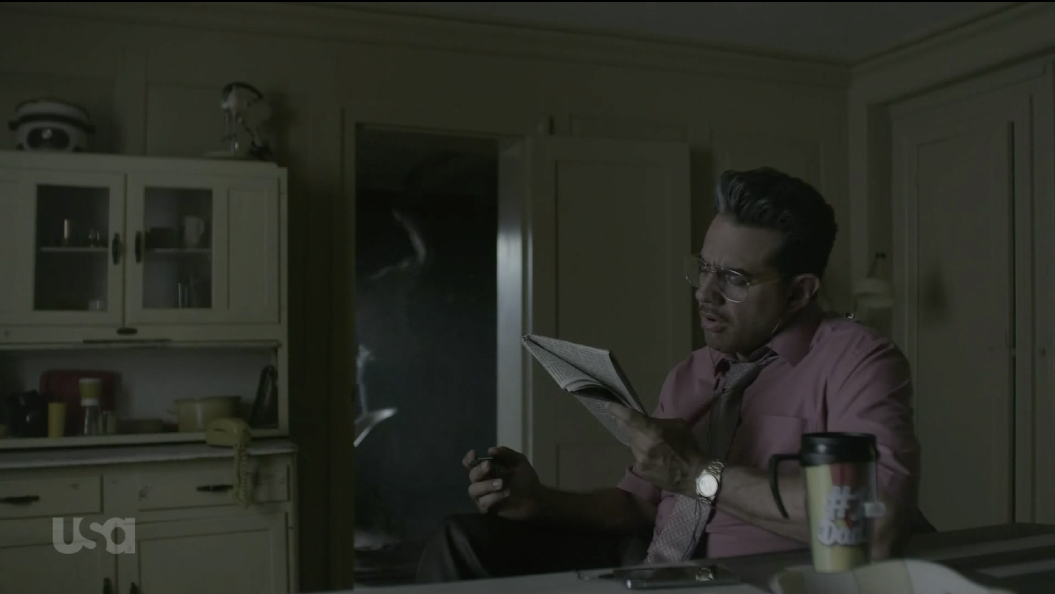
In movies and video footage in general, color grading is used to transfer different kinds of mood to the viewer. I am a big fan of Mr.Robot TV series and not only because I am a software developer. You can pause almost any frame to get a great photograph and colors that they use are just stunning.
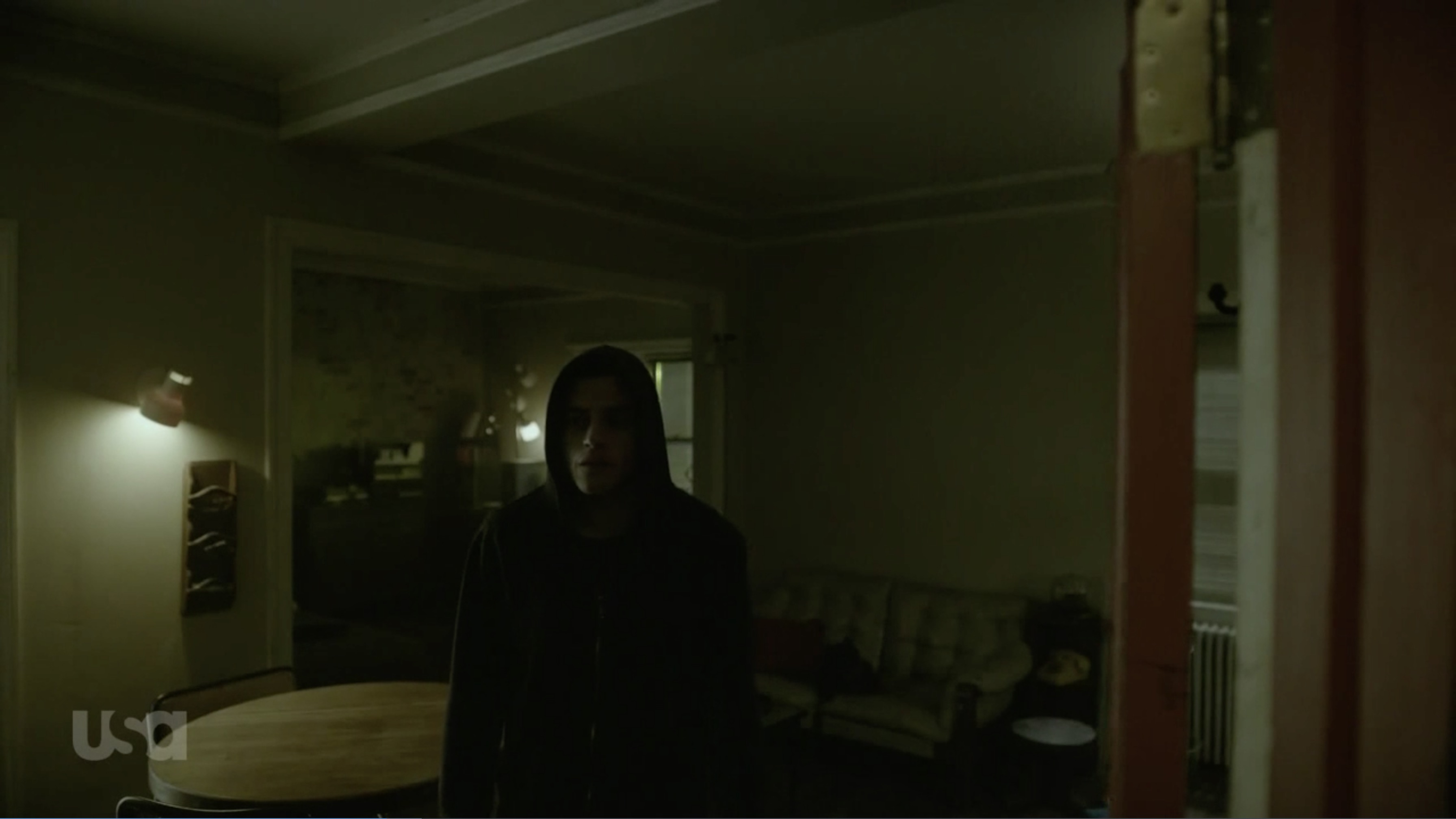
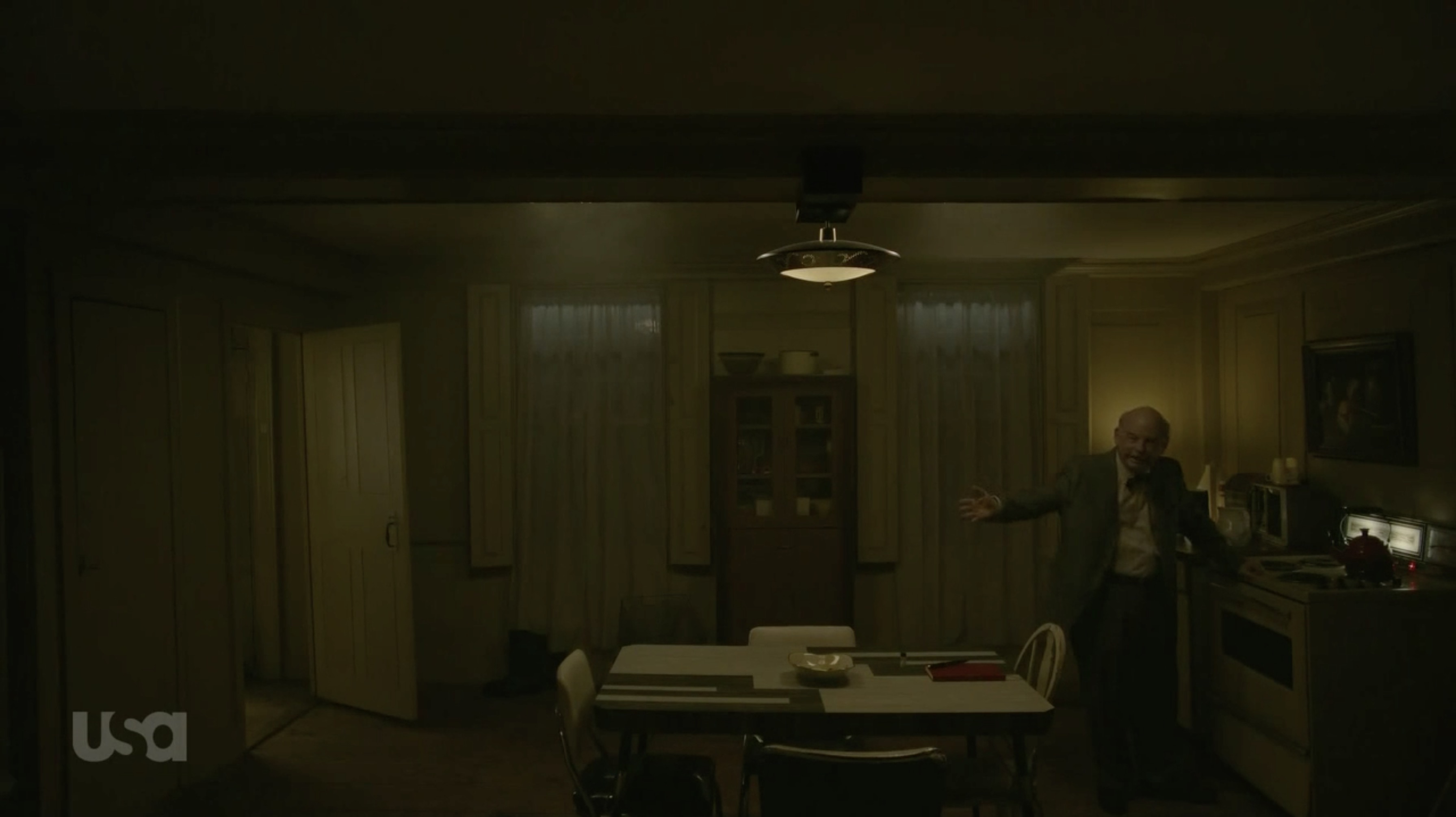
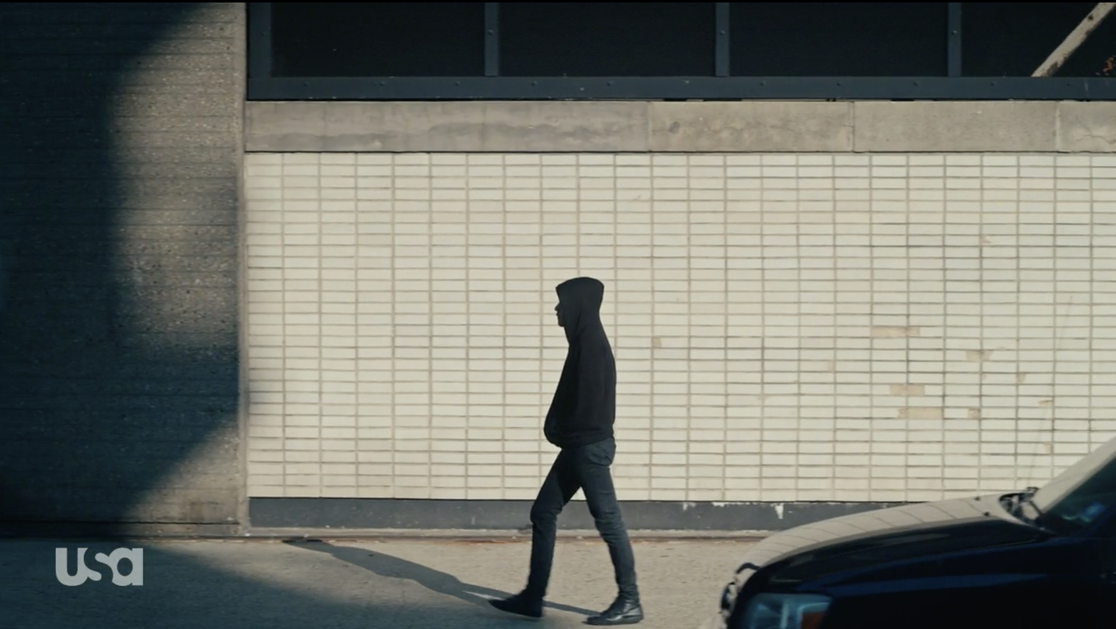
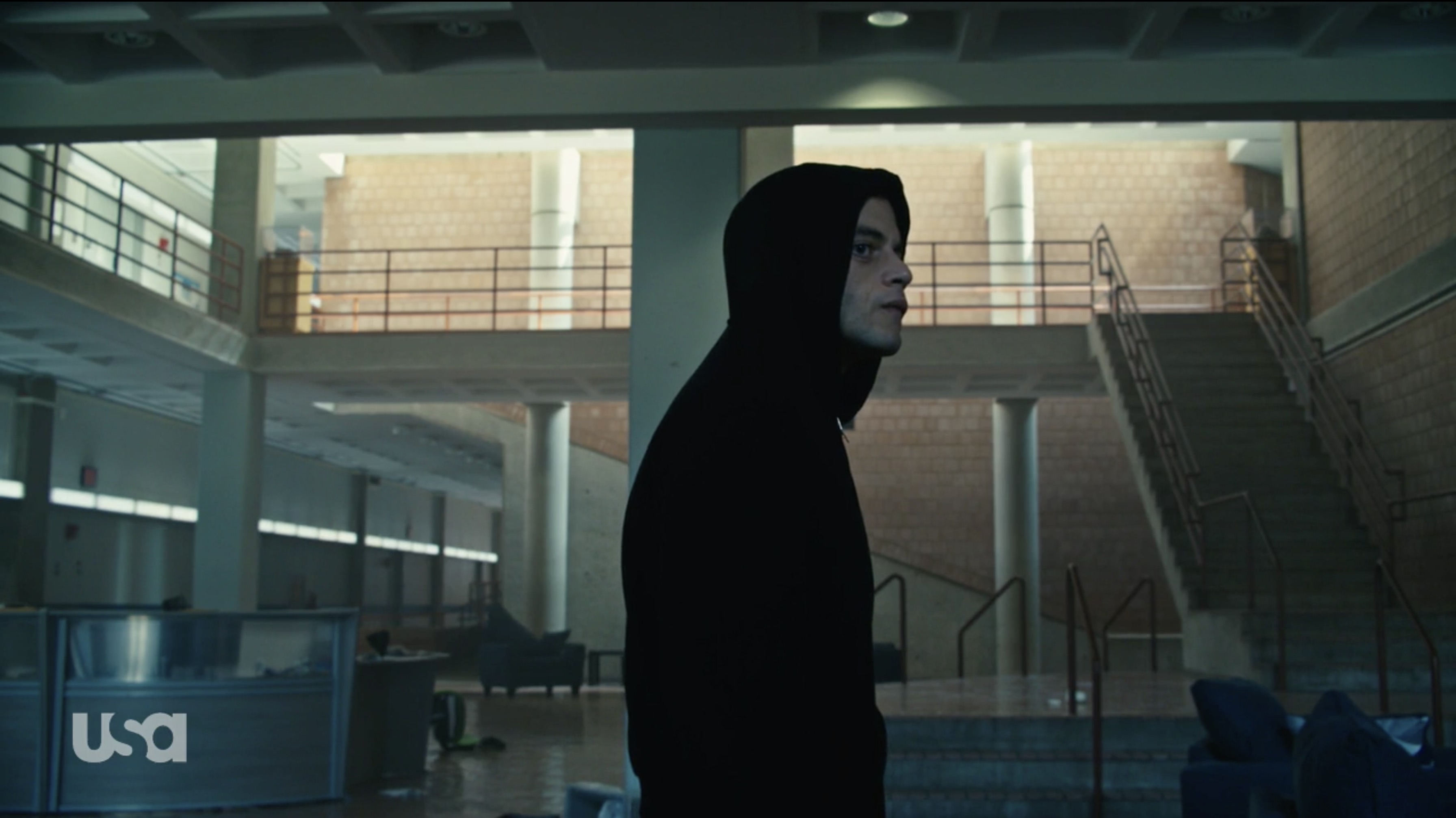
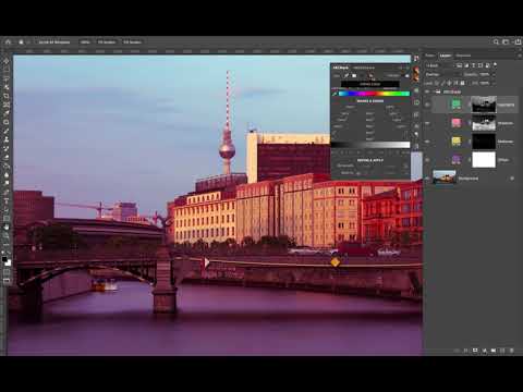
Take a look at these completely different grades they switch between in Mr.Robot.
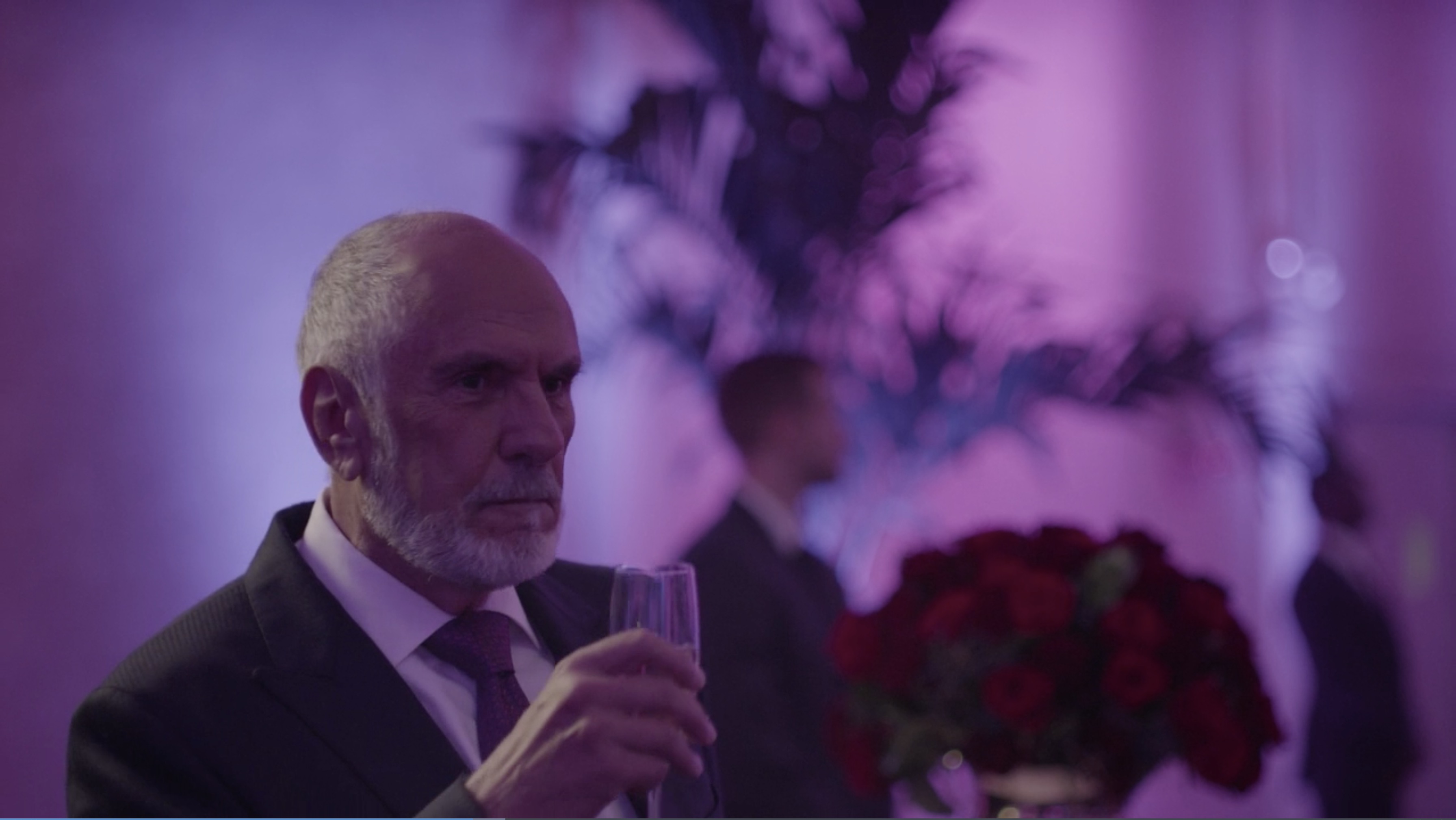
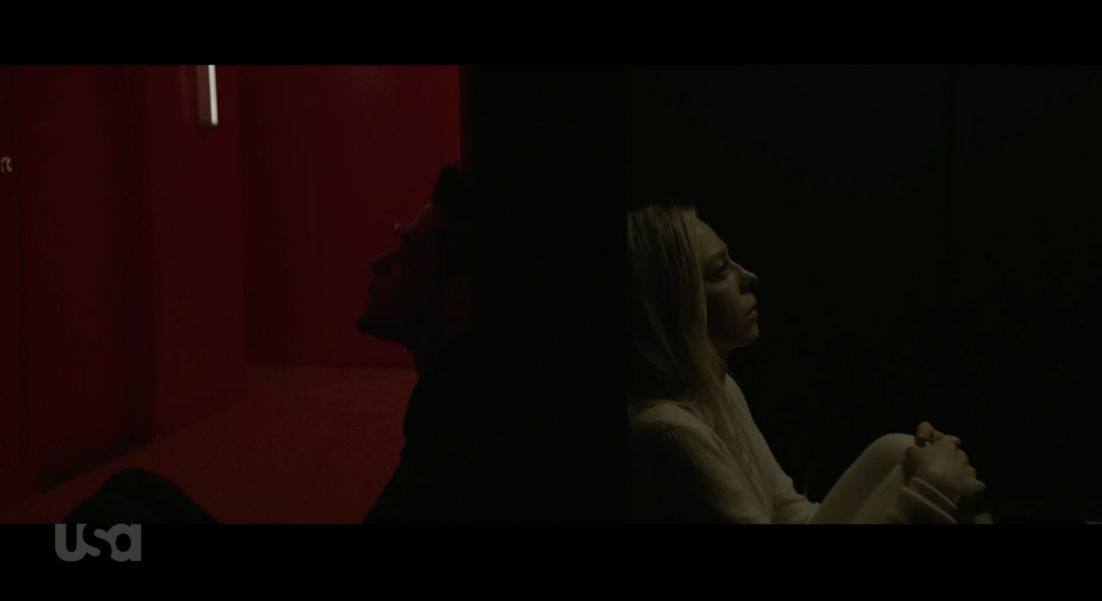
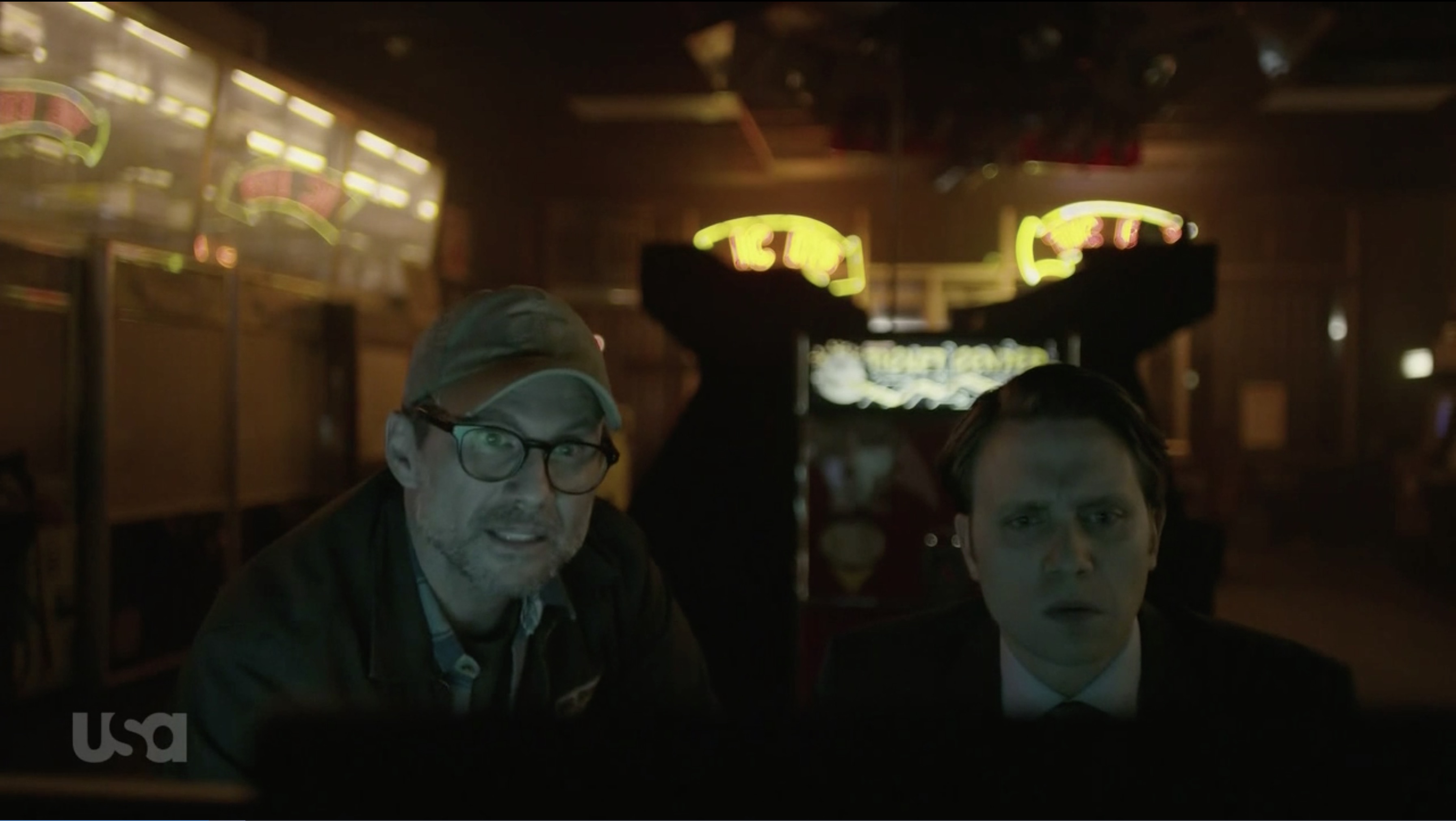
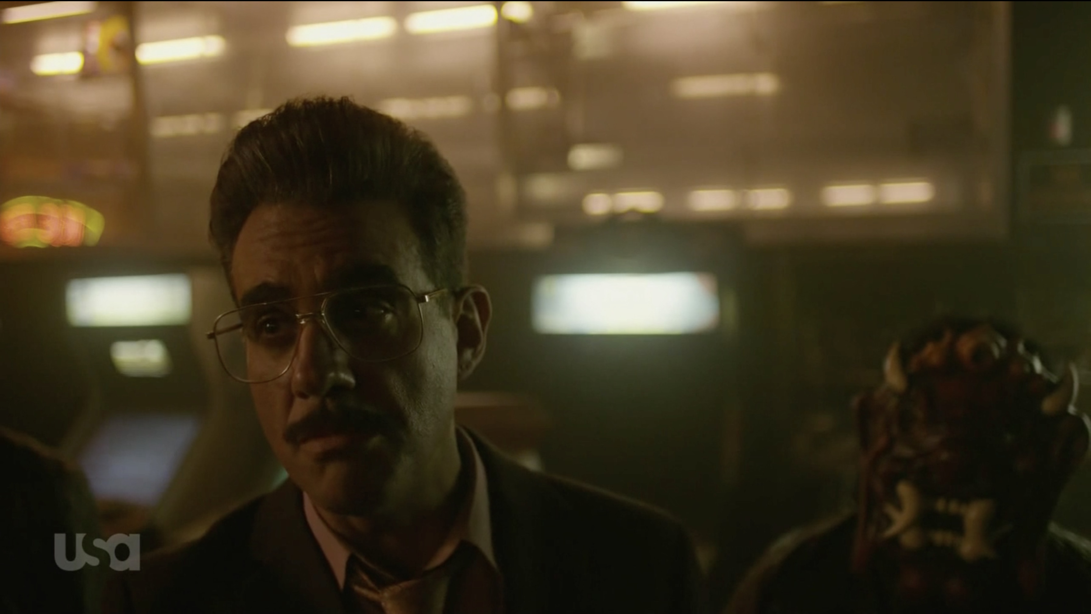
Mr.Robot color grades
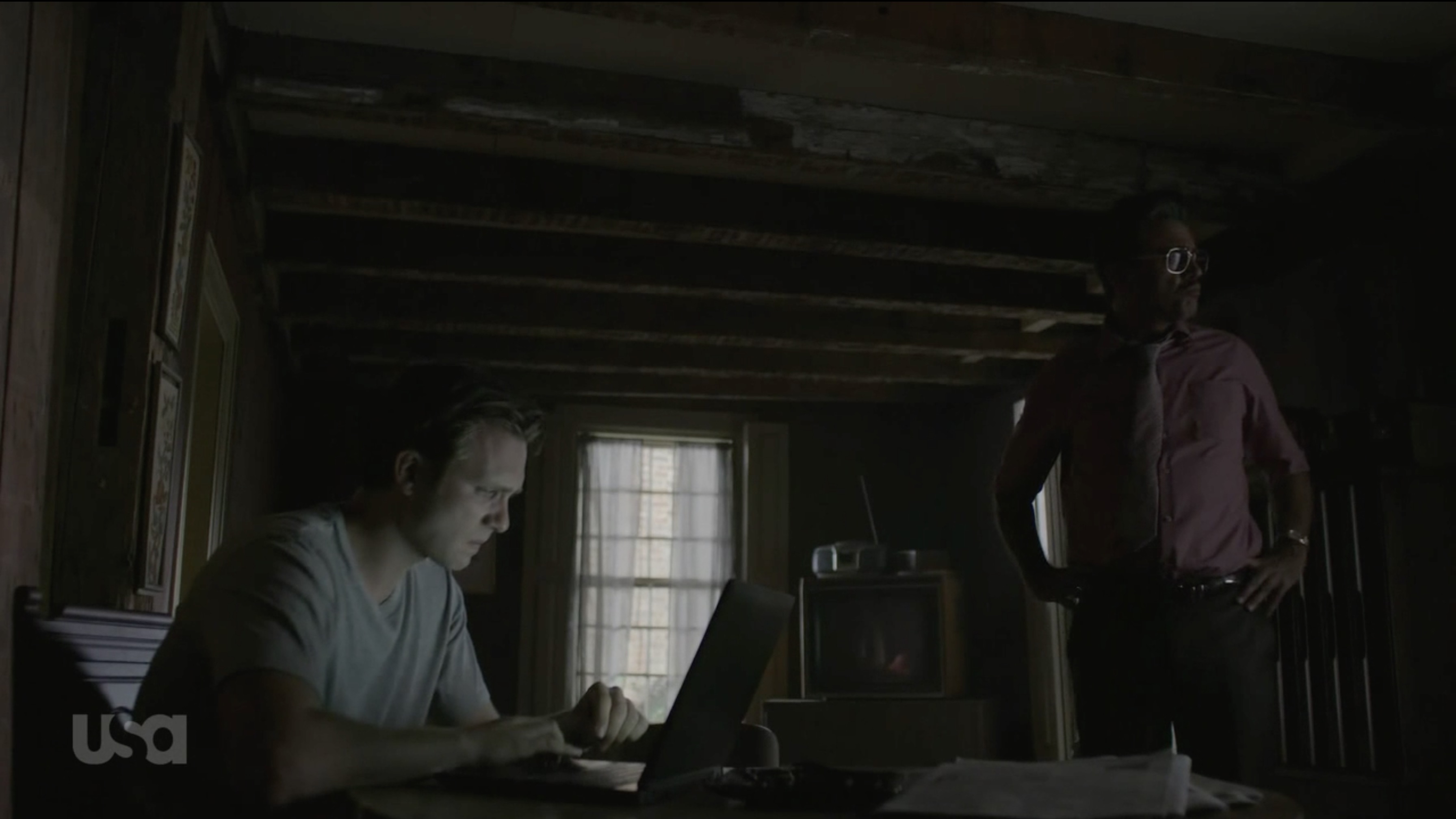
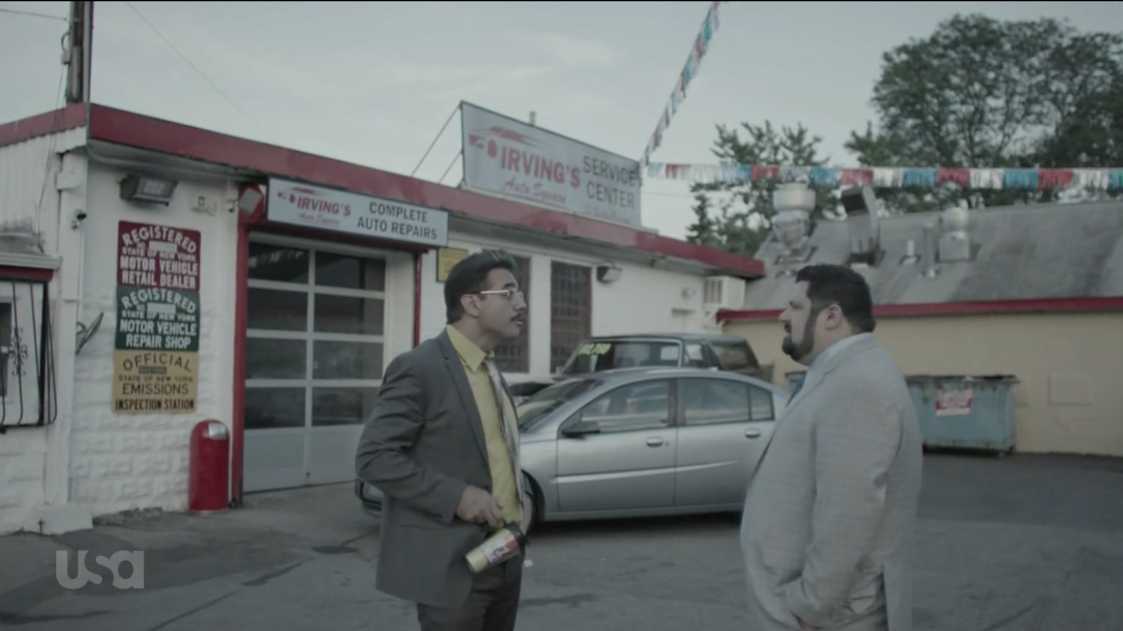
A green "matrix" look is used a lot, but there are also many cold-blue grades getting a little warmer for daytime shots, and even such stunning shots as a scene with Eliot and Angela sitting to other sides of the door, left being all red and right being teal/green.
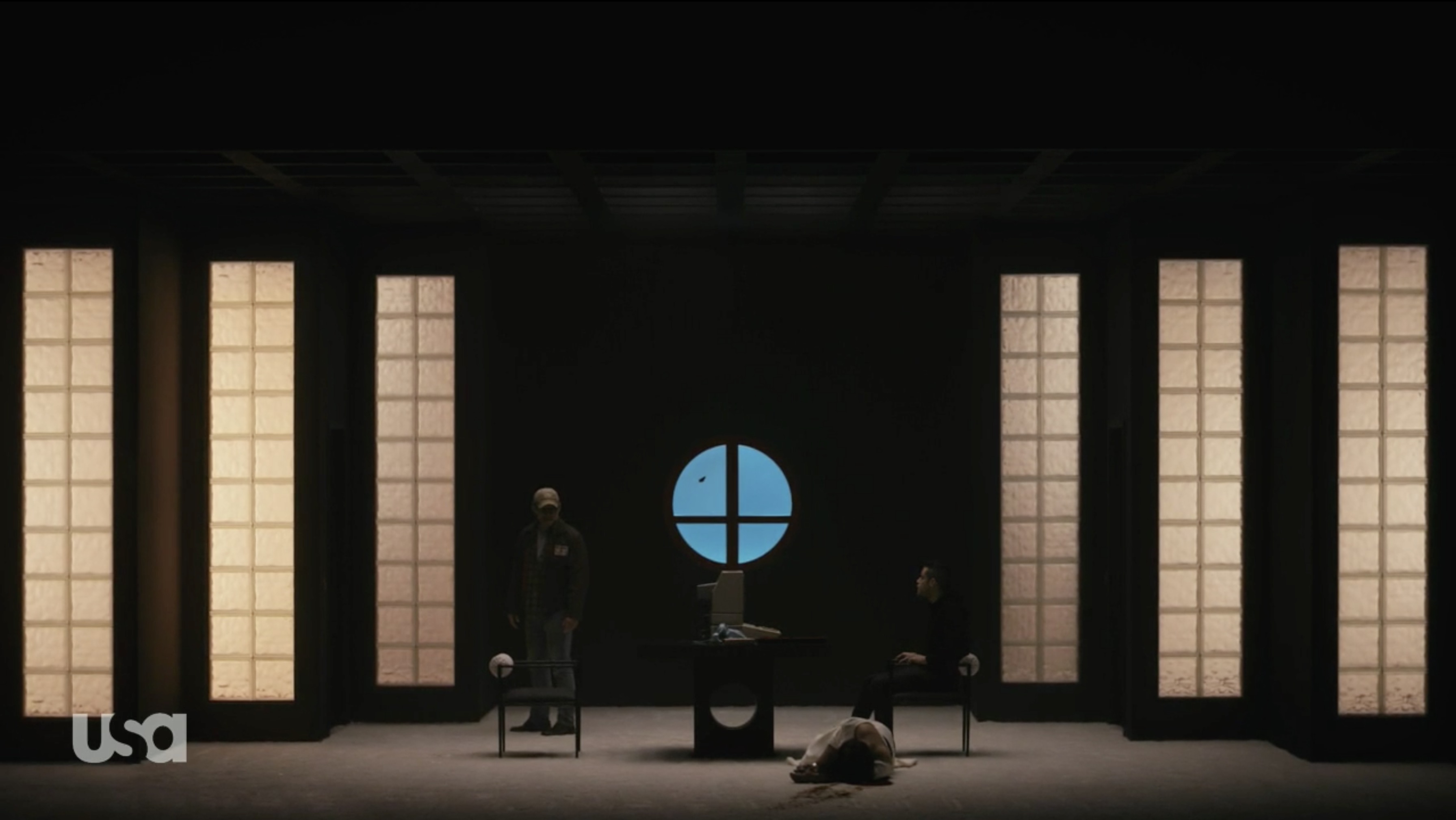
In rare cases, to show the glow of the monitors, green/orange grade is inverted, making highlights blue and background warm. There are even pink/green grades - not the choice of colors you would think should even work together.
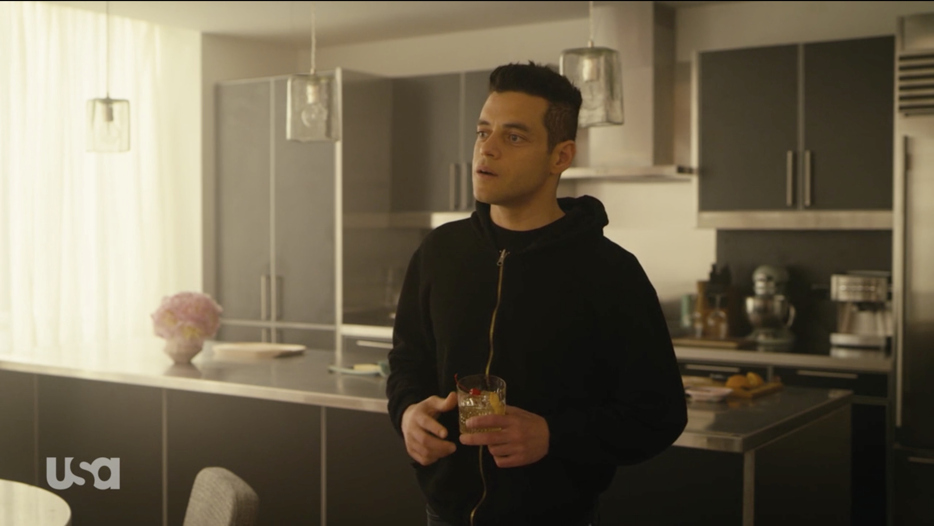
They also use colors on the background a lot to complement the scene. It's just a color masterpiece.
Many grading options
Question is, how to pick the right colors for the image?
All the example grades I have shown above are completely different in terms of which colors are used. It's great when you have and idea of the mood you want to convey already, but still, there are so many variations.
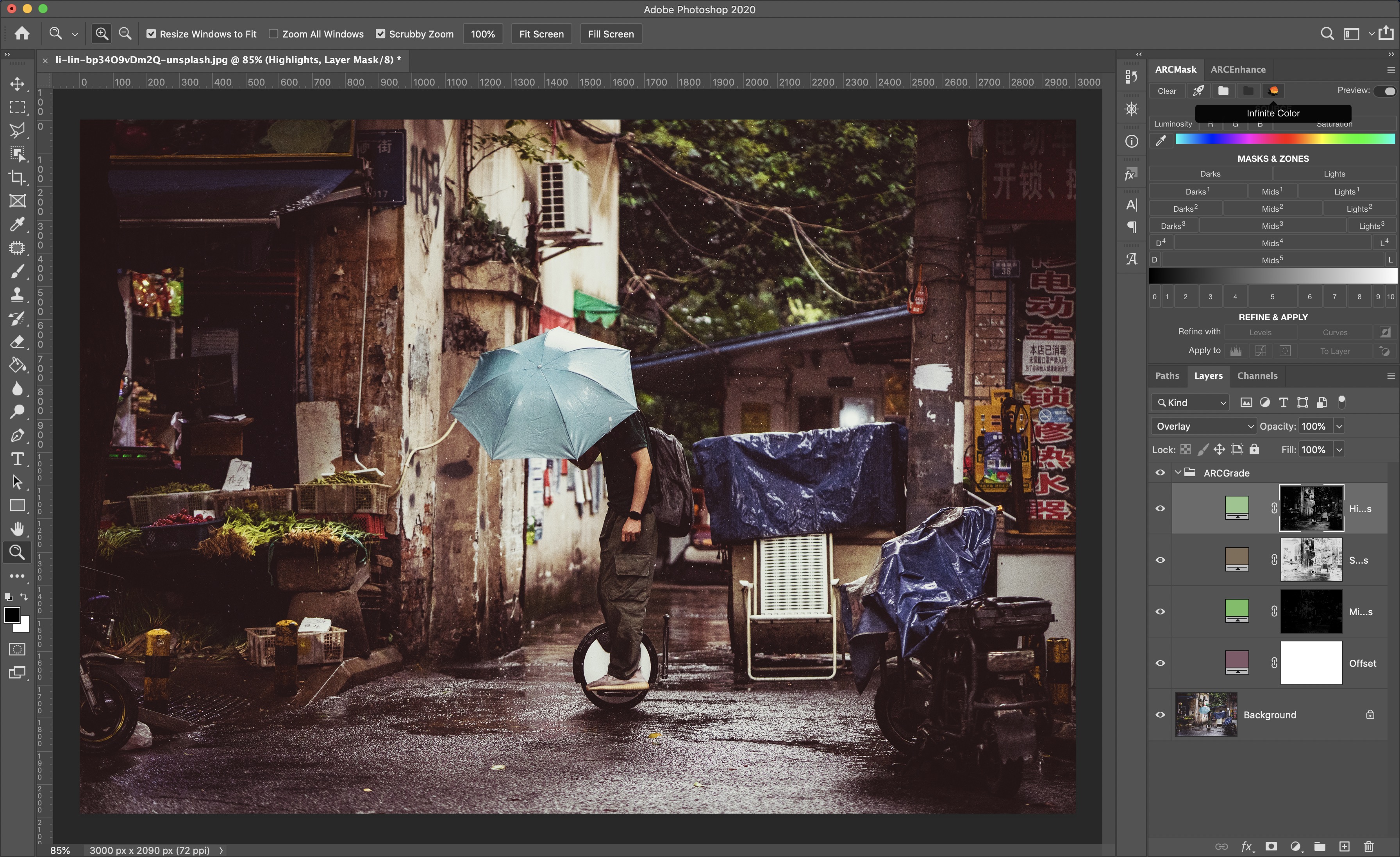
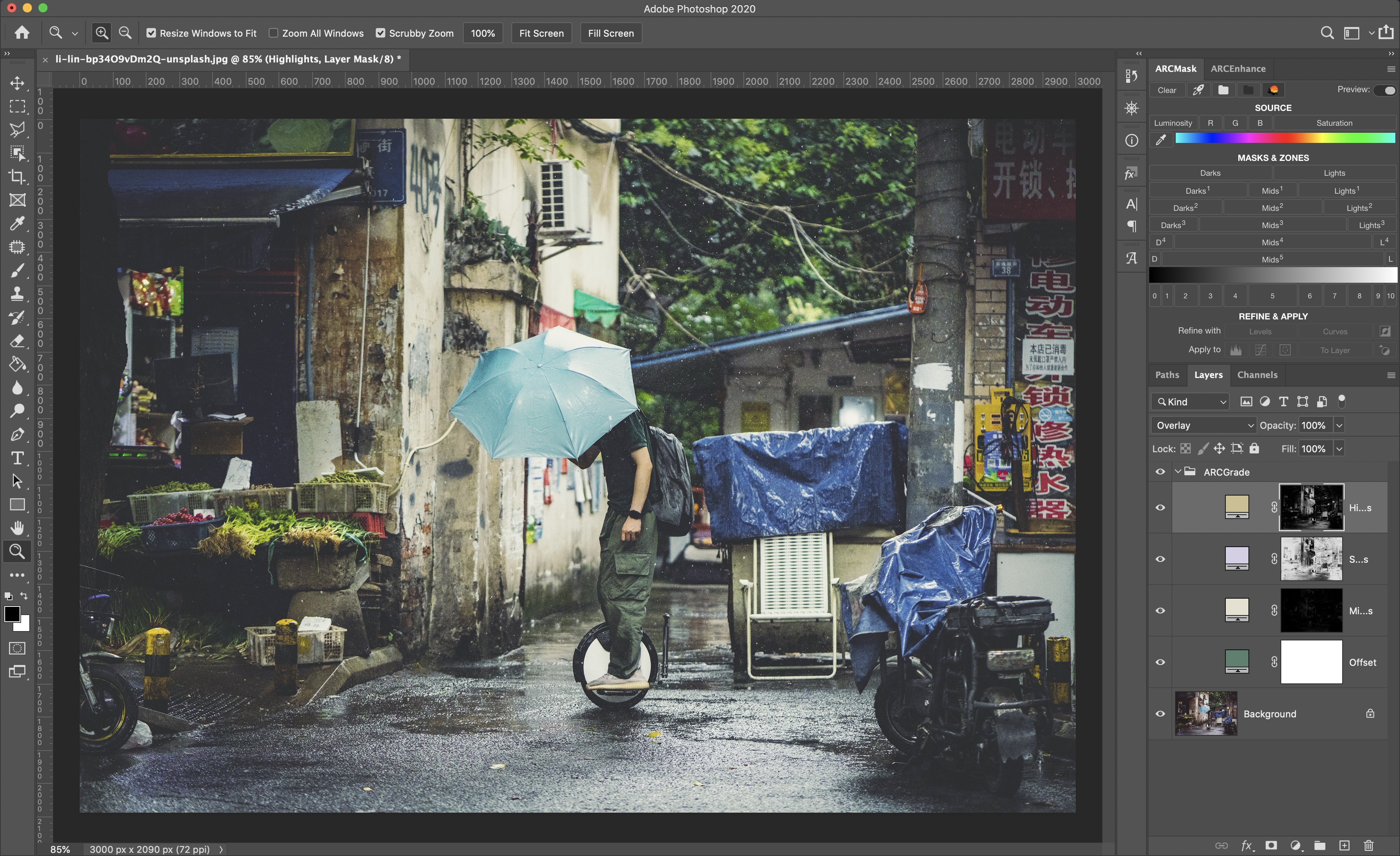
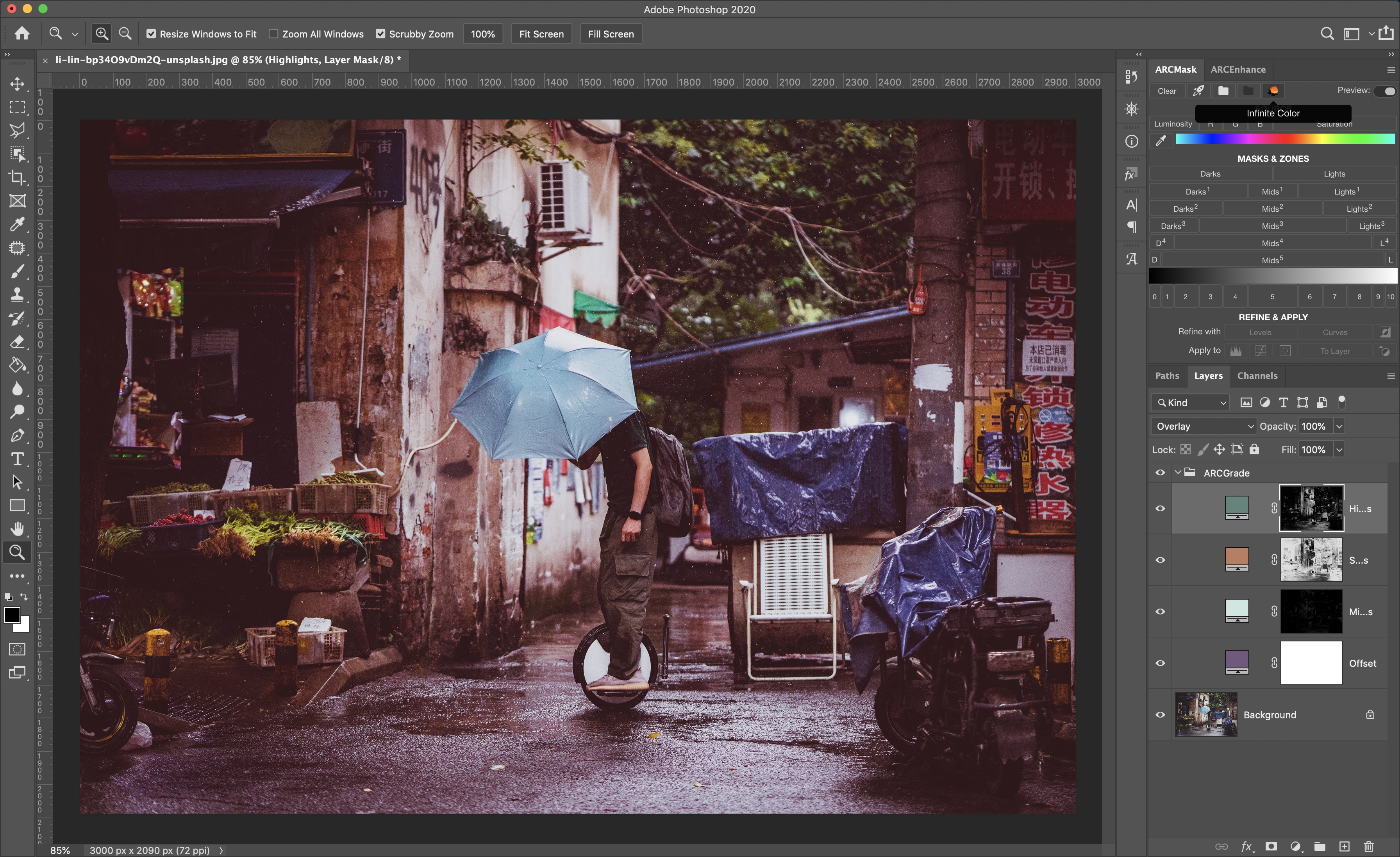
This is where Infinite Color feature of ARCPanel comes into play.
One press on the button will generate you set of grading layers with a random set of colors. Colors are smartly picked by an algorithm to play with each other nicely, so every time you will get a new color variation to apply to your image.
How colors are picked
Many will play nicely with your image because colors are picked keeping in mind the rules of the color wheel. Some will not look very good – a "matrix" look will not play well with a bright and positive portrait, pink grade will not go well with a daylight shot. Still, one more press and you will get a better result.
Here is how colors are picked by the Infinite Color.
First, a random color hue is selected from the spectrum. For that color, an algorithm builds a set of soft/pale colors that are placed either as triad, tetrade or are analogic to each other with an extra complimentary color. Out of the color set algorithm then picks colors for highlights, shadows, midtones and offset, with that finishing the grade.
How to use Infinite Color feature
Here is how I propose to use Infinite Color.
First, process your image to the desired state, making sure you don't have blown out highlights or black shadows.

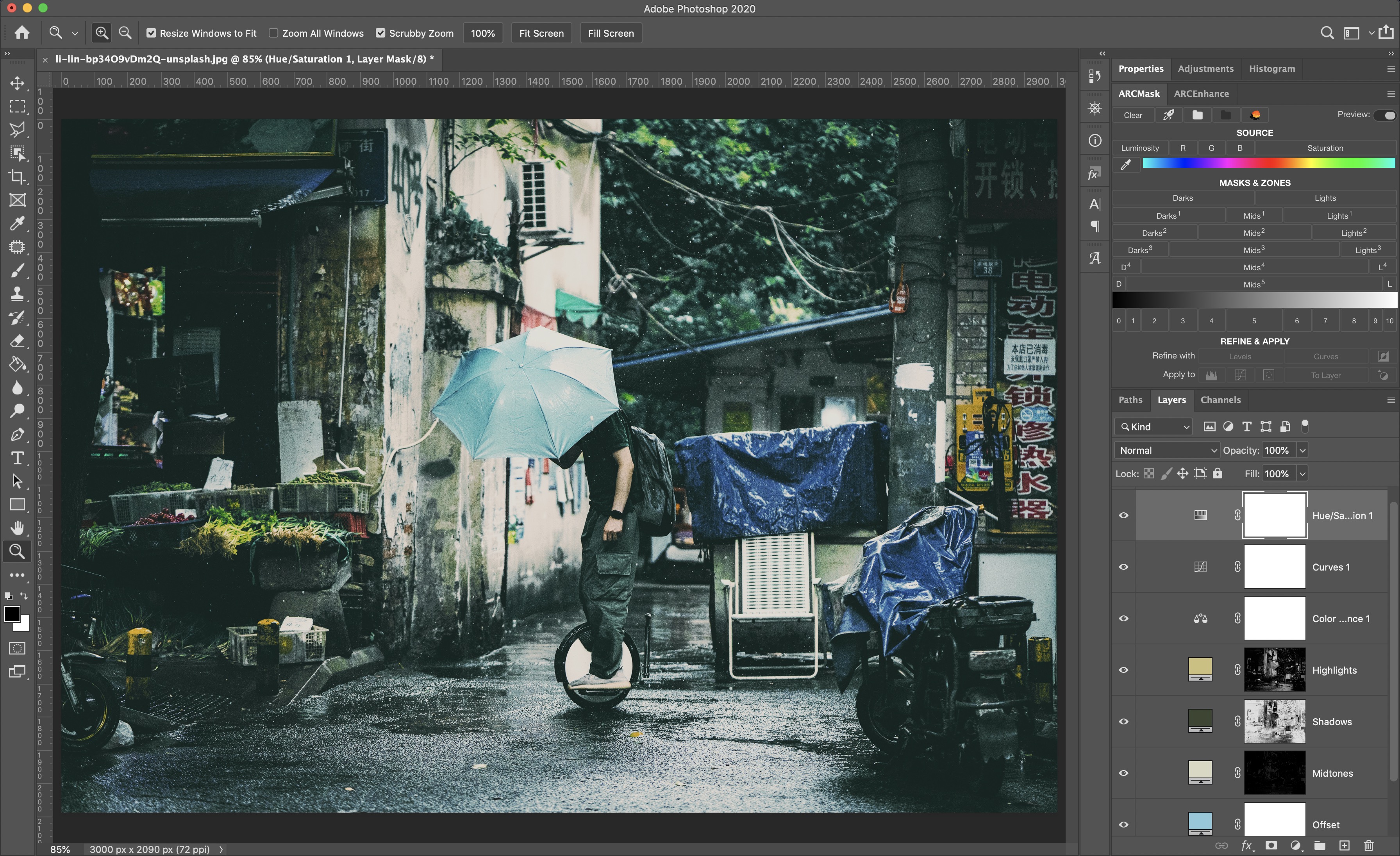
Then use Infinite Color button to cycle through different grading possibilities. Don't worry if some don't look too good on your image – not every grade works everywhere. Once you have a color set that you like, rename ARCGrade group that was created for you into a custom name, for example "My Awesome Grade".
Next step would be to refine the grade. Because panel uses luminosity masks with Solid Color, it's very easy to adjust colors and tweak the grade after it was created. Try to shift colors a little until your a satisfied.
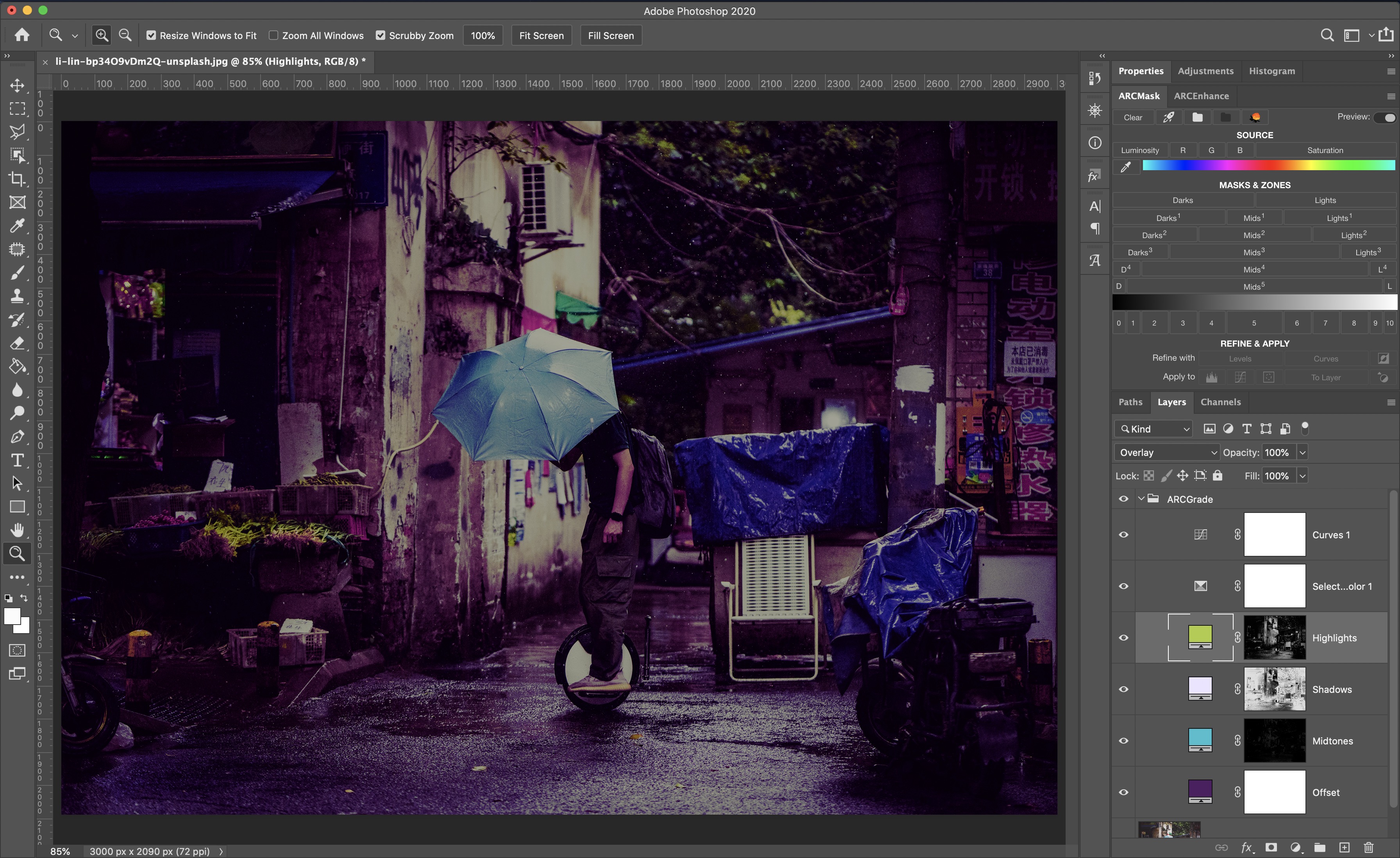
If you image is somewhat dark, Offset and Shadows will have the most effect on the overall tone of the image, there you would need to do the most careful adjustments.

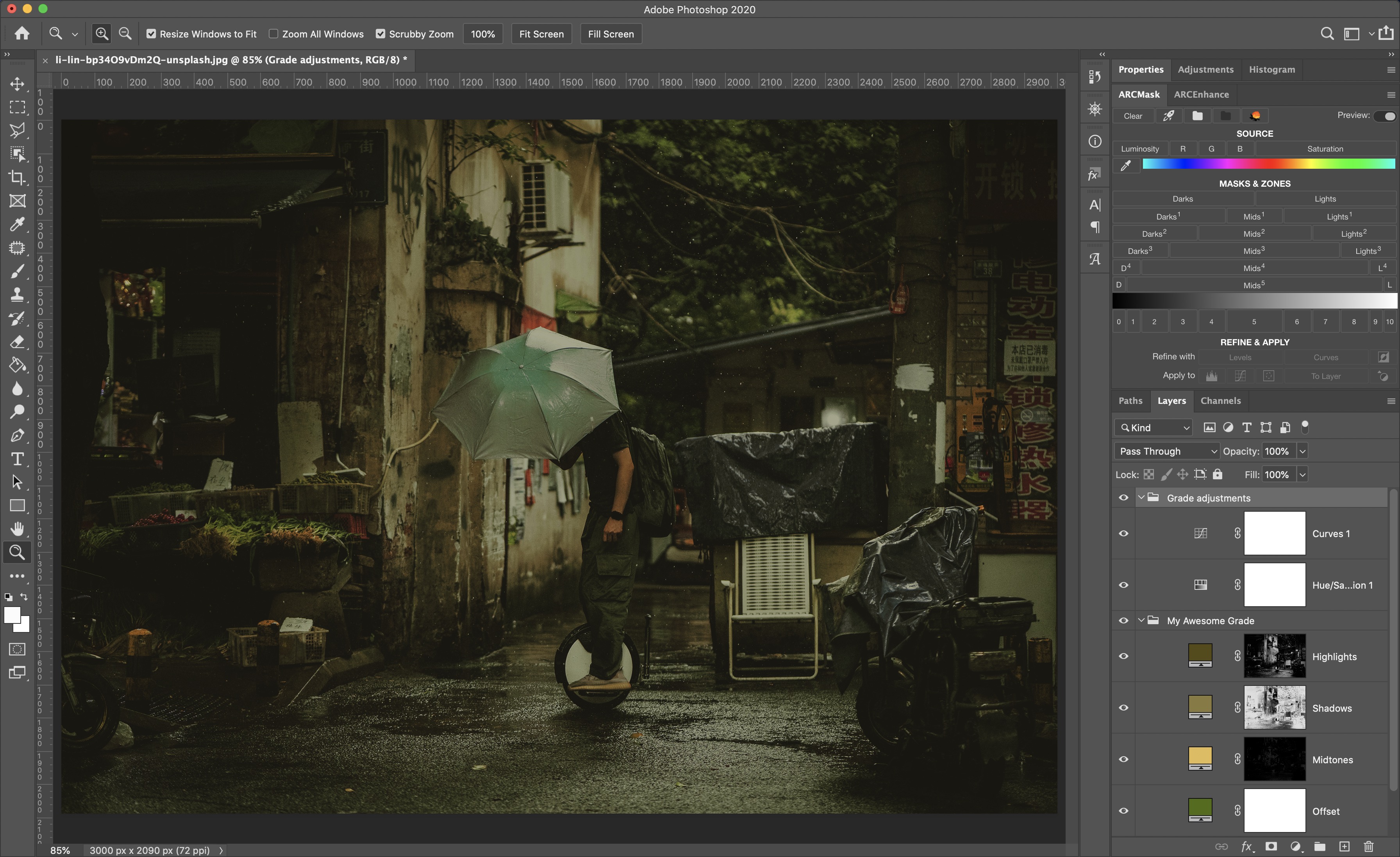
And the last step would be to have finishing touches for the look you are after. For example, in Mr.Robot there are no bright colors anywhere, all the images are very soft and subtle. So to achieve a similar look you would need to use Hue/Saturation adjustment and desaturate some of the colors of the image.

Another option would be to use Color Balance to shift some of the colors, maybe even mask something away. Example could be "Aliens" classical teal/orange look, where even the light from the lamps on the background is cold. Light is usually a part of the Highlights grading layer and there you might have wanted to have warmer orange tones. To make lights colder, you could shift warm colors to the cooler tone and use a regular mask to apply it only on the lamps.
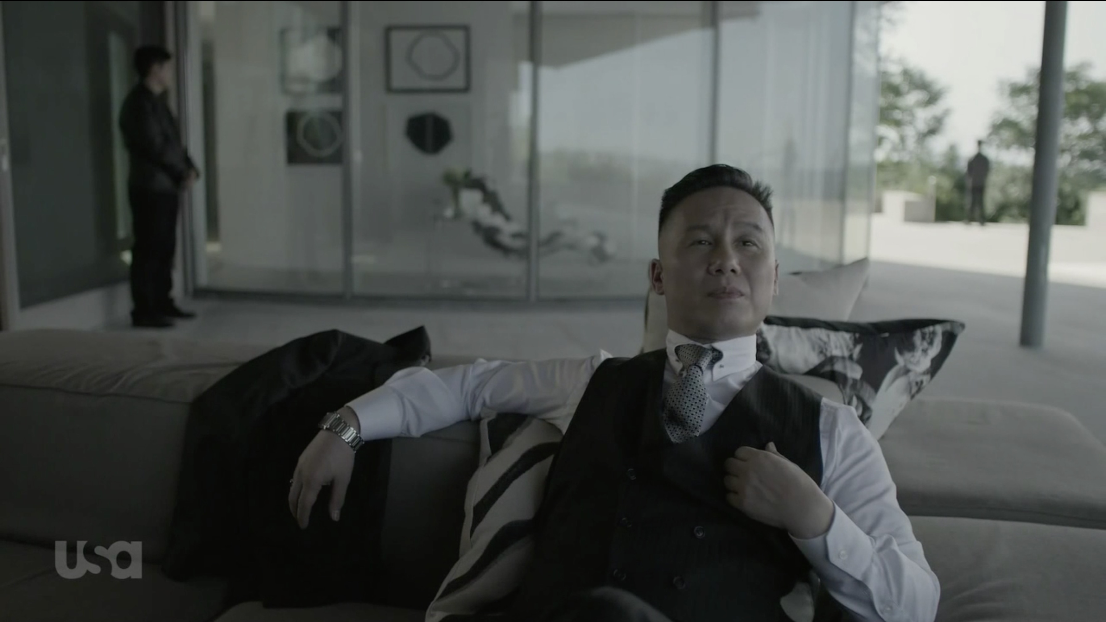
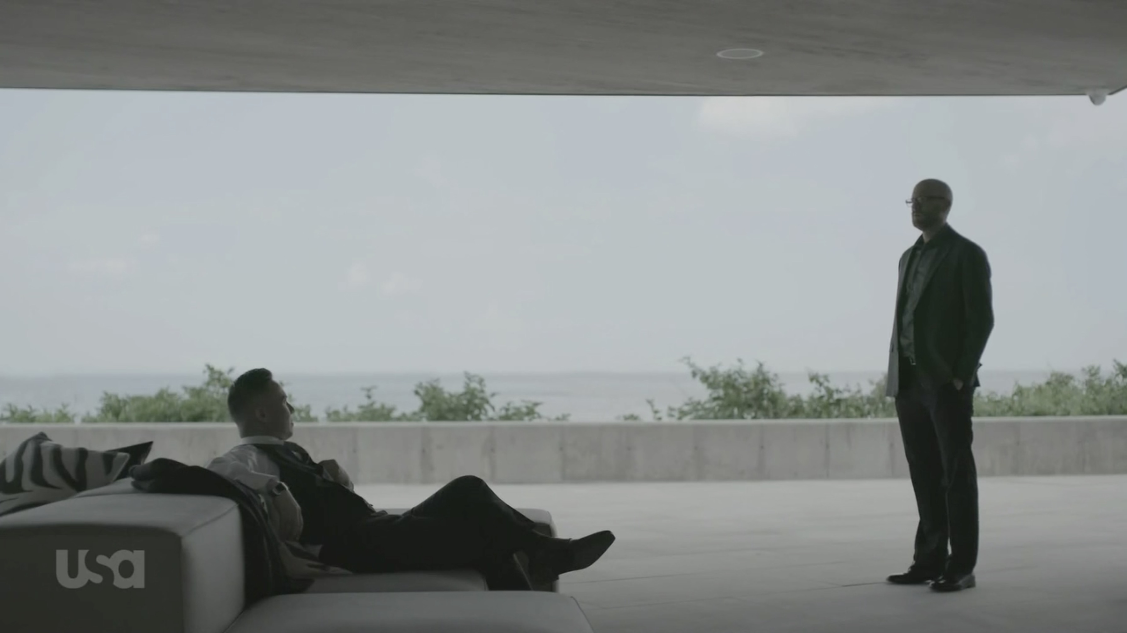
Here are different grades of the same image I made:
The grade you would have to use will depend on what kind of mood do you want to convey.
You can do a positive pink and bright outdoor portrait or a moody indoor shot with deep green shadows. An evening city will look nice with blue tones while in the morning you might want to have brighter and warmer tones to show sunrise.
And finally, next time you watch some movie, try to pay attention to which colors do they use in which situations. This will give you many more ideas on how to approach color grading in our
Preparing login widget...